Increasing mobile engagement with a navigation redesign
Growing mobile engagement with the VA’s healthcare patient portal 6-fold by designing a new secondary navigation pattern.
Overview
My Healthevet is the VA’s healthcare portal connecting Veterans to critical health benefits like prescription management, appointments, and messaging with healthcare professionals. Unlike healthcare-only software like Epic or Athena health, My Healthevet sits within the broader umbrella of VA.gov, which offers many other types of benefits and services beyond healthcare. User research uncovered that Veterans run into challenges with the site's global navigation elements, leading them out of the health portal to the broader VA.gov without a clear way to get back. Mobile users (30-50% of overall traffic) have the worst experience of all, because poorly designed navigation components get missed on these devices.
My team's challenge was to help Veterans more easily access the comprehensive suite of tools for managing their healthcare, and provide a sense of place within the constraints of the broader VA.gov. We needed to help Veterans understand that they are in a container (a patient portal) with a specific purpose (healthcare management), and make it just as easy to find what they need on mobile as it is on desktop.
Since its launch in June 2024, this updated navigation has been remarkably successful in bringing mobile engagement with the health portal to near-parity with that of desktop devices. The numbers show a 6-fold increase in mobile engagement on VA.gov, moving averages from 3% usage on mobile to 19% in less than 4 months.
Design process
When approaching this problem, we had to factor in existing navigation patterns. VA.gov already has global sitewide navigation, which collapses into a “hamburger” menu on mobile devices. We couldn’t re-use that pattern, or re-use the label “menu” and needed to design a different approach for secondary, more localized navigation.
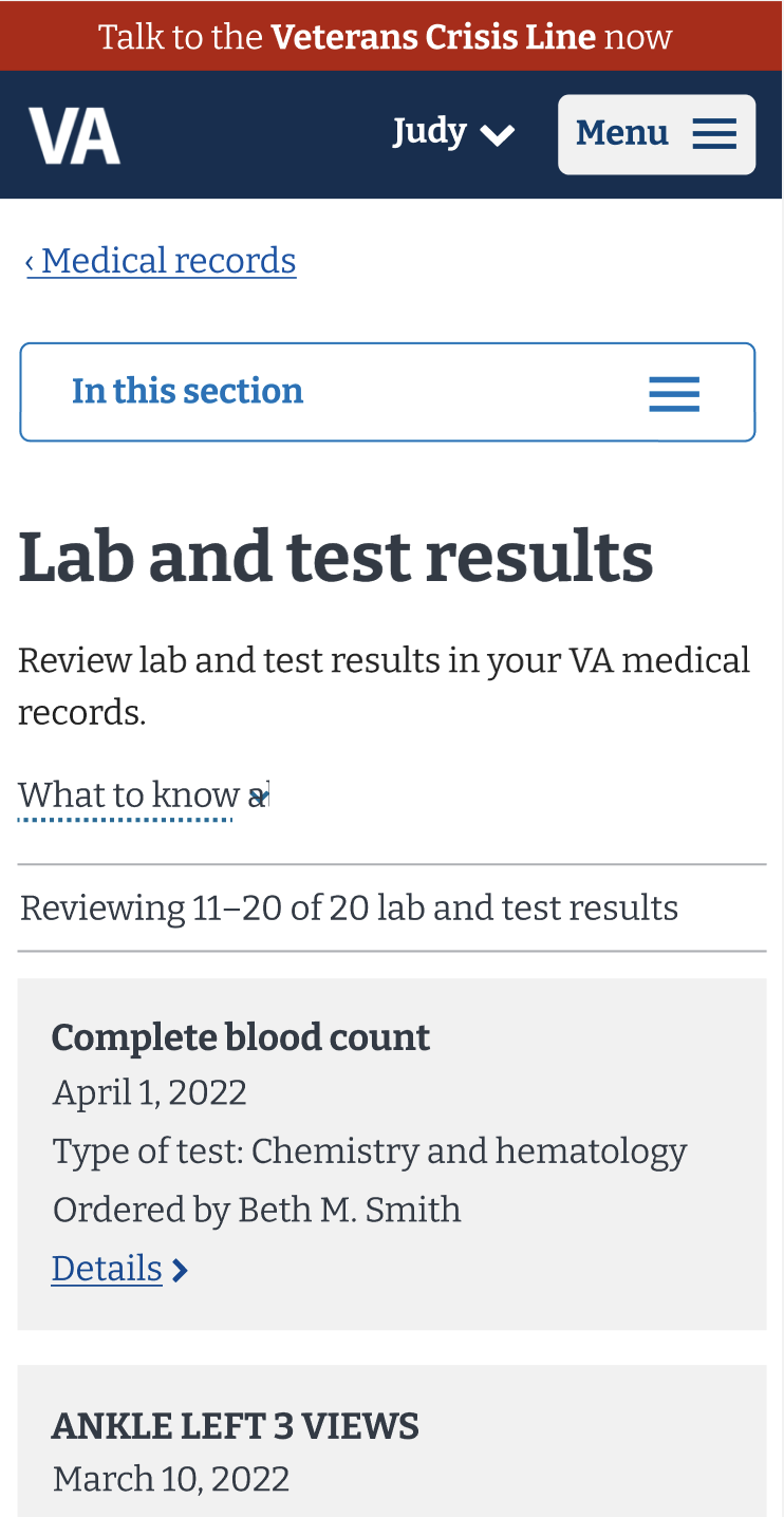
We also already knew that the existing secondary navigation pattern (image below): a drop-down menu labeled “in this section” was getting almost completely missed by mobile users. Only an average of 3% of mobile users ever engage with these menus.


I conducted competitive analysis and did a lot of ideation. In close collaboration with stakeholders, this led us to ruthlessly simplify and prioritize only the four biggest health tools.
Keying in on the four highest touch tools has a side-effect of de-prioritizing other health resources. You can’t prioritize everything. To address that, we added a link in the navigation bar to My HealtheVet home, which is the central landing page for the health portal. This page then facilitates access to lower-touch tools. Other strategies (such as in-product cross-linking) also contribute to making those things findable.

Caption: Screenshot of competitive analysis whiteboarding and brainstorming
My team landed on two variations and ran an A/B study. One design prototype was preferred over the other by 100% of our 16 participants.

Design A
Caption: design preferred by 100% of research participants. This option never collapses on mobile. Terminology gets abbreviated on smallest screens.

Design B
Caption: non-preferred design that is an interation on the sitewide drop-down style pattern.
Challenges & curveballs
Challenge 1:
Prior to taking new prototypes to usability testing, my team faced stakeholder pushback about departing from the established secondary navigation pattern on VA.gov. Existing quantitative data already proved low engagement, but my team was asked to further validate that this pattern did not work with Veterans before we could go in a different direction.
I helped conduct a mobile-only usability study using prototypes that mocked up the health portal with the existing sitewide secondary navigation pattern. After analyzing feedback from participants, the results conclusively confirmed that the existing pattern was not effective. This finally got us buy-in to move forward with new concepts.
Challenge 2:
The usability study mentioned above did provide interesting granular feedback from Veterans about pain points with collapsed mobile navigation menus in general. As the health portfolio’s information architecture lead, I began to have a strong instinct that we should try to design and test a solution that didn’t collapse on mobile devices at all.
That hypothesis was validated by research and 100% of research participants preferred a design option that stayed visible on their mobile device despite screen width. But this finding re-introduced challenge 1, whereby some stakeholders focused on how difficult it would be to pattern this approach sitewide. Getting approval to launch this new design required many conversations and re-analysis of data to build trust with stakeholders that this pattern would lead to positive outcomes for VA healthcare users.
Impact
After some controversy and split opinions among stakeholders, this pattern was approved and shipped in June 2024. In the time since, I’ve evaluated the impact of this design with quantitative data.
Analysis proves that this pattern has increased mobile engagement with the health portal to near-parity with that of desktop devices. It has outpaced other secondary navigation designs on VA.gov, giving us hope that we can someday scale this approach more broadly.

Average % of desktop users that clicked: 17%
Average % of mobile users that clicked: 3%

Average % of desktop users that clicked: 20%
Average % of mobile users that clicked: 19%
Before & after
We launched this new navigation in June 2024, as part of a major migration and launch of multiple health tools onto VA.gov. This pattern has been very successful in achieving the “sense of place” within the health portal that users were needing, and serves as an easy-to-use “super highway” to the main health tools on VA.gov. Since it does not collapse on any device, no matter the screen width, there is a lot of continuity to the experience from desktop to mobile. Users understand this local navigation, and it keeps them within the health portal.